

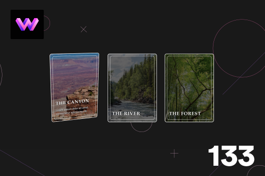
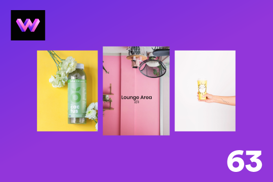
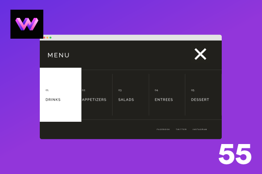
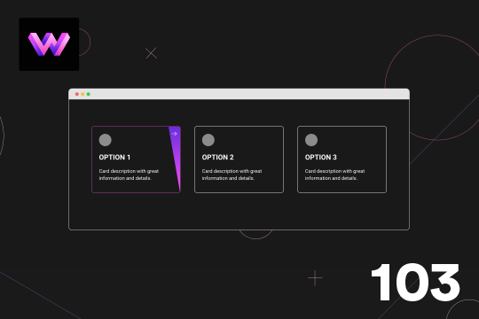
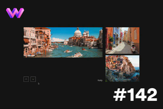
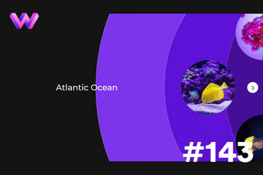
This demo showcases a unique card flipping animation on hover in Webflow. In this effect a panel rotates in from the left to reveal more information about the image, or post and the image slides to the right to make room for the flipping panel. The effect was achieved by placing an image wrapper and content wrapper with a child perspective added to it. The content wrapper is set to 50% within the 3D wrapper and the transform-origin was set to the left so it would rotate in from the left side. Another div block with the background image was added inside of the image wrapper, and the image wrapper was set to overflow of hidden so that the image slides to the right you don't see it beyond the wrapper. Interactions were created via rotation of the content wrapper -90 degrees to 0 degrees and moved the image to the right 50%.
A unique product card animation on hover in Webflow. When a user hovers over a card the image shifts down, and a border appears with an animation, there's also a description of the card that appears as well. This animation effect was built entirely with Webflow's native interactions.
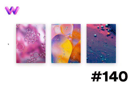
Here's a project card animation on hover in Webflow. When hovering over the image a gradient overlay and text appears on the card. Lines also animate around the image and blow the project title and below the image. The effect is achieved by placing the lines in teh correct position around the image and then setting the initial scale to 0 in interactions. The lines horizontal x-axis is set to 0, and the vertical line is also set to 0. The transform-origin for each line around the image is set so that each line animates into the correct position. Then the lines scale back to 1, and the gradient overlay and text changes from 0% to 100%.
Here's a 3D parallax style card interaction/animation for Webflow. With this effect a card rotates on mouse move, and the image inside the card rotates 360 degrees that gives the effect that hte card is moving. A caption also appears on the bottom section when hovering on the card. The card is in a 3D wrapper with a child perspective applied to give it a 3D effect as it moves.
A very unique, fold in curtain style menu animation navbar for Webflow. The menu is revealed from both the top right and top left of the page. You could add different images or colors for the panels coming in. You could also add a variation of different textures or styles to those divs, or keep it simple and use this example. The animated menu was built using Webflow interactions. The rotating text inside of the menu was created with Illustrator, After Effects and Lottie.
A dynamic info card hover interaction for Webflow. When a user hovers over the card a box moves from the title and displays a description while the image changes to color. A wonderful interaction that adds a level of animation and interaction to an info card.
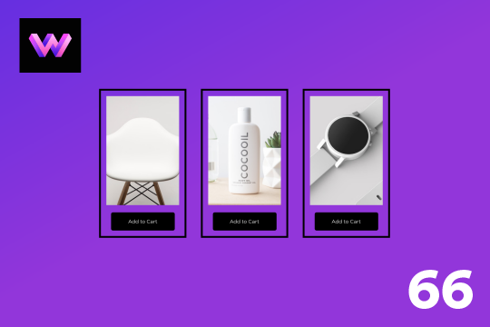
An add to cart hover button animation for Webflow. When a user hovers over the Add to Cart button a shopping cart icon slides in from the right side. This helps users understand the action taking place on the button and helps add a new level of dynamic buttons to your Webflow site.

Here's a way to achieve a unique hero section using grid and the Wizardry method in Webflow.
Here's a unique and fun button with border animations in Webflow. Initially the button looks rather basic, however with a few line animations it makes this button really pop. The lines were placed within wrappers and set the wrappers to an overflow hidden. The move animations to each line was added to control which direction the lines came in from with the different hover states. Scaling the lines doesn't allow for transform-origin to be changed on the different states, hence why the move option was used instead. There are 6 line wrappers with lines inside of them and they are all placed on different sides of a button with a position of absolute.
Showcase and feature your CTA by adding moving lines to the border in Webflow. Using this technique you can showcase anything that you want to draw the users eyes to by adding moving lines and a 3D hover rotation to products, cards and other important aspects on your site.
Here is a unique button with hover animation in Webflow. When you hover on the button the border outlines in a cut from two different points which makes the line look segmented. When you hover over the button the lines seem to move in a clockwise fashion and then reverses on hover out. This was achieved by placing two skewed div blocks at the top and bottom of the button with. the same color as the background. The div block was placed precisely on top of the button border. This makes it look like the border is being cut. Then those to blocks are moved left and right on hover to make it seem like the lines are moving. It's a subtle, yet unique effect that adds an interesting effect on hovering on a button.
This is a unique interaction in which images reverse movement based on mouse location in Webflow. There are two images facing opposite directions on both sides of the screen. When ou move your mouse on the x axis the images get further and closer apart. It's a very simple effect but can be modified to create endless opportunities. This used two identical images to save on load time and one was flipped horizontally on the y axis. Both images are set to overflow hidden. Then in interactions a mouse move in viewport interaction was applied to both images and they move on the x-axis.
Here's a hover effect that adds a border and lines around a logo in Webflow. This effect was achieved by setting the border color to transparent on the initial state and then changing it on the hover state. Lines were placed with a width of 15px and a height of 3px. In interactions it was scaled from 0 to 1 on the x and y axis for the horizontal and vertical lines. To reduce the number of interactions required a class was created for the corner horizontal and vertical lines. Then a combo class was dded and placed the lines in the different corners around the logo. This allowed the use of only two interactions for the horizontal and vertical lines.
Here's a way of creating a parallax hero image on page scroll in Webflow. As you scroll down the hero section a layered effect occurs with the landscape image. A great way of adding depth to a Webflow site that intrigues the user as they scroll down the page.
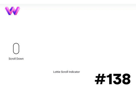
Add a dynamic indicator to let your users know how far down the page they've scrolled via this interaction on your Webflow site.
Examples of creating mouse over 3D text effects with Webflow. The text letter effects is created via a Mouse move interaction and the rotate effect. All of the interactions are created with Webflow's native interactions and no custom code aside from a small CSS snippet for pointer events none.
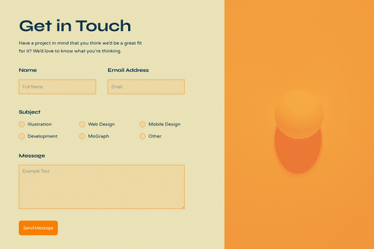
Here's a walkthrough and tutorial of how to build a contact form in Webflow. View the tutorial here: https://www.youtube.com/watch?v=H8-fbOJpC5I

Here's a full screen menu navigation with animations and interactions in Webflow. This is a great way to easily add a menu/navigation to your Webflow site. This was comprised of three components during the build process. First, an image wrapper with an image inside of it. Second, the blue background and third a right wrapper with the menu items inside of it. The image wrapper and right wrapper are both 50% width within the menu. The width of the blue background is 150% so it has a quicker animation as it scales in. By having separate wrappers inside of the menu wrapper the scaling effect can also apply to the image, and the blue background as well as individual animations to the menu items. The menu trigger also turns into a close icon on click and then back to the hamburger button.
Here is a unique project flipping card animation for Webflow. In this example the cards flip 180° upon clicking on the card, the card also has a hover over animation in which the stars scale in and out behind the image. On the mouse move the image moves around the card. For the stars a 6x8 grid of 50x50 blocks were created and added within two div blocks inside the cross. In the interactions they are set to rotate, scale and loop on hover. On hover out the crosses go back to the original size and stop rotating. For the image moving there is a mouse move over element interaction and moved the image 20px to each side as the mouse moves around the card. On click the card flips via a rotation to the card, so it was placed in a 3D wrapper and added child perspective to it.
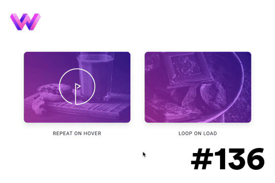
Looking to add animated play buttons to your Webflow site videos or other media? Here are a few different variations of animated play buttons. One variation repeats the play animated button, and the other animates on the hover over state. All of these are accomplished via Webflow interactions.
A demonstration of product cards in Webflow that utilize hover over interactions to effect both image and title. When a user hovers over the cards in Webflow the image div grows and the title appears to follow the mouse while hovering over each card. A fun interaction and a way to showcase products in a unique and creative way.
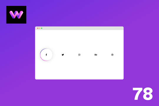
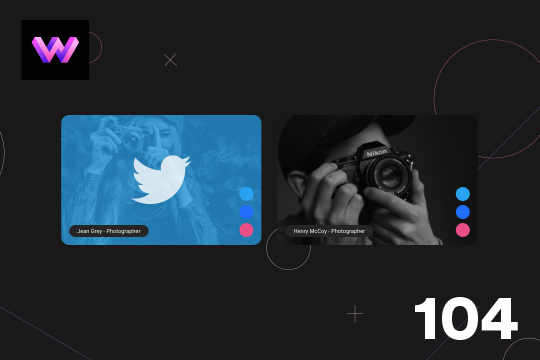
A simple way to add social media links with a hover animation to your Webflow site.
Here's a way to add a custom, social media sharing hover interaction to your Webflow site. When a user hovers over the icon on the page a social media sharing interaction is triggered that displays 4 different social media sharing sites.
Here's a wonderful 3D card hover effect in Webflow. When a user hovers over a card a 3D effect is shown and folds down and additional information is displayed. This is achieved via interactions and rotates the image 90 degrees back and a content wrapper rotates 90 degrees on hover. The effect was achieved by placing an image wrapper and a content wrapper inside of the 3D wrapper. The 3D wrapper has a child perspective applied to it via the transform option. This allows the div block inside of the wrapper to have a 3D effect as they rotate in and out. The transform-origin for the image wrapper was set to the bottom and the transform-origin for hte content wrapper was set to top. In the interactions rotation and opacity animations to both the image wrapper and content wrapper. Both div blocks are rotated on the x-axis.
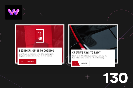
Here is a wonderfully designed blog card animation on hover in Webflow. When a user hovers over the card the image rotates, a color overlay appears, and the date of the blog post appears. The summary panel below also moves up. When hover over the read more button the background and text changes color. The way this was achieved was by adding all the elements and then animated via interactions. for the image it was placed inside of an image wrapper and set the overflow of the wrapper to hidden. The width and height of the image changes to 150% so that when it rotates it is still visible inside of the wrapper.
A fun demonstration of animated icons with hover states in Webflow. They're very simple line icons with subtle, yet unique, hover interactions. One thing to note with the shapes that change size is that the size animation rather than scale, as adjusting scales adjusts the widths ever so slightly and doesn't make the animation look precise. Size and move were the only two animations used for these shapes. The only easing was used was ease and all the animations have a duration of .5 seconds.
Using Webflow's new blending modes this text effect on scroll becomes apparent of the capabilities of blend modes.
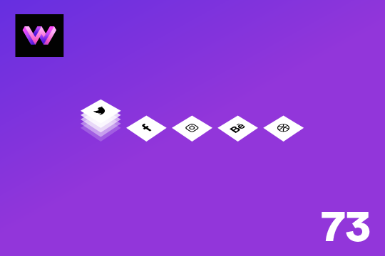
An animated, 3D layered social media sharing buttons for Webflow. When a user hovers over the buttons they pop up with a 3D layering effect on your Webflow site.
A full screen menu for Webflow with hover over interactions. This menu features all the native Webflow interactions required for building a full screen menu. When a user clicks on the hamburger button the Webflow menu slides in from the top. Each menu item includes a hover over interaction in which the cards expand and the colors turn from black to white background and the fonts also change at the same time. Closing the menu slides it back to the top of the page.
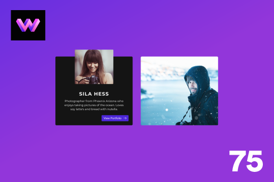
Here's a great way to add dynamic hover states to your team cards in Webflow. With this profile card design several hover states are displayed with various scaling and movements. The top circle has social media icons to make the card more functional and display relevant information. The bottom has the name of the person displayed in a rectangle. The hardest part of this interaction was adding all the shapes into the card. Specific wrappers were used and positioned around the wrapper in an absolute position. For the rectangles at the bottom they were skewed on the x axis -20px. Take note, when you add a move interaction to these shapes the skew property gets removed so you have to add the skew property to the initial state of the interaction as well.
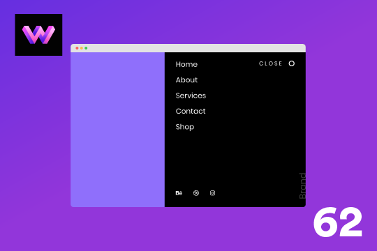
A right side menu for Webflow that slides the menu in from the right hand side on click. This menu features all of the interactions required to create a Webflow menu. When the user clicks on the hamburger button the menu slides in from the right part way on the screen. There's a menu item hover interaction which has a highlight effect that grows on hover and then fades out on hover out.

Here's a demonstration of utilizing ztext.js for 3D text effect on mouse move in Webflow. The background was created from an SVG generator.
Here's a unique way to add transition animations to a full screen slider. Using both Swiper.js and a GSAP animation script.
Here's a demonstration of a call to action card with a hover animation in Webflow. The hover animation appears at an angle when the user hovers over the card. This is a great way of indicating that the card can be clicked on and visit another page. To create this animation a card wrapper is created with all the elements in it. Then a card wrapper was set to relative and a div block was placed inside of the card wrapper and set the position to absolute and 50% width and 120% height so that it could be angled without losing the height at the top. Then this div was moved 100% to the right from the card. With interactions the div was then rotated -10 degrees. An arrow as then placed in the slanted div block and rotated the arrow 10 degrees to offset the -10 degree angle. The border color also changes on hover.
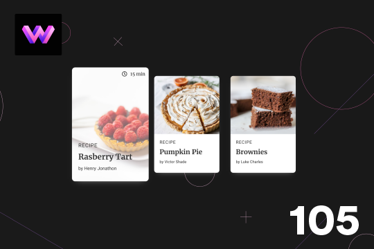
Here's a unique, recipe card animation created in Webflow. This is perfect for showcasing recipes on your Webflow site in a unique and interactive way. When hovering over the card the image becomes full height, and the card moves forward on the z-axis. The card was placed in a wrapper with a perspective applied to it to bring the card forward. Also a timer icon shows up on the top right corner to display the time it takes to create each recipe.
Here is a 3D info card animation on hover in Webflow. When you hover over the card an image panel rotates in horizontally to reveal the content. The effect was achieved by adding a div block with a child perspective applied to it. Then another div blcok was added inside of the 3D wrapper. With the interactions this div block was rotated from 90 degrees to 0 degrees on the X axis. Since the wrapper has a child perspective it creates a 3D effect for the panel as it comes in. It also has a reveal from top to bottom as the panel comes in.
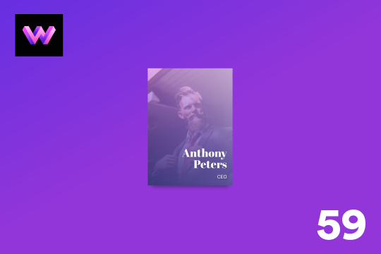
Here's a unique team, about card hover animation for Webflow. When someone hovers over the profile image the image zooms out, and the name, details and a button is then displayed.
Here's a way to showcase several different slides transitioning per click. This is achieved via micro interactions for the previous and next buttons. The interaction for the arrows was created in After Effects and custom code was utilized to trigger multiple slide changes at once.
Here's a way to add a rotating outline for buttons in Webflow. A unique and eye catching animation that draws your users attention to important buttons on your Webflow site.
An info card for Webflow that features hover over interactions. This free Webflow cloneable features cards with unique hover over interactions. When a use hovers over the card the image turns from black and white to a color gradient overlay and an information block is shown with additional information about the post/card.
Here's a wonderful parallax card animation on mouse moving/hover states in Webflow. This effect uses a gradient overlay that moves with the mouse on hover, and the border moves in the opposite direction of the mouse while hovering. The text moves and rotates left and right with the mouse movements. This effect was achieved by placing the gradient overlay and border within the card wrapper. The text was placed in the bottom right of the border div using flexbox. Then, interactions were added via the mouse move over element and the elements move and rotate on the x and y axis when the user moves over the card wrapper.

Easily add a grainy effect to your entire site. This uses a grain png that was on a Webflow site. You can create your own grains as well to change it up.
Add a unique circular slider to your Webflow hero. This demo showcases a circular slider with animated panels via the background. These panels were created in Adobe After Effects and triggered via a slider element within Webflow. The main slider is also linked to a secondary slider that showcases the text. The sliders were then linked together via custom code.
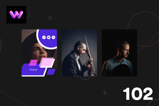
A unique card hover animation in Webflow that creates a 3D parallax style interaction. A great example of what can be built using Webflow's native interactions. When hovering over the card a two layer parallax effect is shown with the top transparent purple layer separating from the bottom image layer. Both layers seem to transform in a 3D space while the Name and Title moves at a different rate than the other two cards.
Here's a unique way to show off your team cards on your Webflow site. When you hover over a card a social media panel appears on the right hand side. The dots are color coded to match the brand color of the social media platform. You can place text or icons inside of these dots as well. On the hover a panel appears with the brand color and a large social media icon. The image rotates -10 degrees to 10 degrees on hover. The animation is pretty straight forward. The only thing to note is that the dots had to placed in the same wrapper so that when you hover over the dots you could target a sibling element within the interaction. This allowed to make sure that the effect could be repeated across multiple cards by targeting the sibling classes of the dots.
A product card with hover animations for Webflow. When a user hovers over the card the title of the product appears, and a few icons appear as well as the price staggered from the bottom. There is a cart icon that can be used to add the product to the cart, an eye icon which can link to the product page, and a heart icon that can link to a counter of some type.
A unique interaction that features a hover over animation for images that creates a swirling effect as well as an animated button overlay. The interaction can be used for blog cards or any other type of card or element which links to another page.
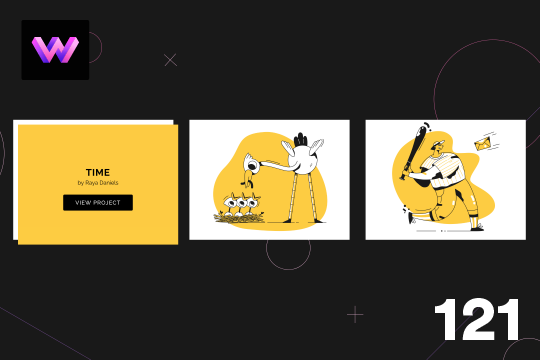
Here's an example of displaying information on card hover animation for Webflow. When hovering over the image card the title, author and view project button appears from the upper left of the image. The effect was achieved by placing a div block inside of the card wrapper. In the interactions the div block was set to an opacity of 0% initially. On hover the div block moves to the lower right and the opacity changes to 100%. On hover out the div block returns to its original position and the opacity changes to 0%
About
WebDevForYou
WebDev For You. Visual web development made easy.