


Cloneable tags
Description
The Responsive Dropdown Navigation cloneable is a great tool for easily adding a responsive dropdown menu to your Webflow site. With this cloneable, you can quickly get your navigation up and running and it's already responsive and mobile ready. This dropdown menu is perfect for any website looking to add a simple and effective navigation system that works seamlessly on all devices. The Responsive Dropdown Navigation cloneable was created by Fritz Wierper and is categorized under the Menu category.
Related cloneables


A unique way of showcasing your logo front and center and have it move up on page scroll in Webflow. This adds a fun dynamic element to your Webflow site and draws the users attention in. This interaction was created entirely from Webflow's native interactions using the While page is scrolling functionality and size, move, scale, opacity and more. This requires no additional custom code and can be cloned and setup quickly.


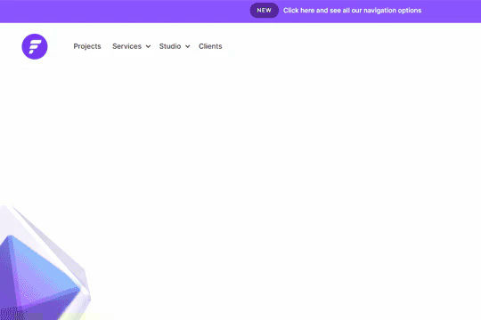
A fully cloneable mega menu navigation with full page dropdown interactions for Webflow. A great way to quickly get your Webflow menu/navigation launched with pre-built dropdowns, CTA buttons, and more. This was built with clear class names, native Webflow interactions, basic dropdown triggers and fully responsive.
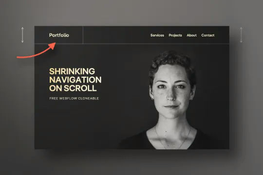

Have your navbar shrink on page scroll via this Webflow cloneable. Easily create dynamic navbars for your Webflow site that shrink upon scrolling down the page. Once a user reaches a certain point on the page the navbar transitions from dark to light while shrinking. This does not require any custom code and utilizes Webflow's native interactions. This utilizes Webflow's While scrolling in view for two different classes and as previously mentioned does not require any extra custom code. This cloneable is perfect for anyone looking to create a dynamic navbar that allows for dynamic changes based on the users scroll depth on the site.
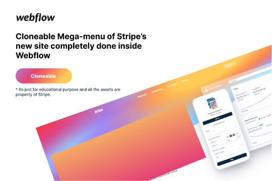

Here's a rebuild of Stripes mega menu design in Webflow. Add a unique mega menu design and navbar to your site inspired by Stripe's mega menu.
A well designed starter dropdown navigation menu with hover over for Webflow. This consists of clear class names, 100% native interactions and basic dropdown triggers. It's also mobile friendly and responsive design.


A very cool scrolling spiral menu text effect. Opens up a fun opportunity for a unique full screen menu build.


Here's a full screen menu navigation with animations and interactions in Webflow. This is a great way to easily add a menu/navigation to your Webflow site. This was comprised of three components during the build process. First, an image wrapper with an image inside of it. Second, the blue background and third a right wrapper with the menu items inside of it. The image wrapper and right wrapper are both 50% width within the menu. The width of the blue background is 150% so it has a quicker animation as it scales in. By having separate wrappers inside of the menu wrapper the scaling effect can also apply to the image, and the blue background as well as individual animations to the menu items. The menu trigger also turns into a close icon on click and then back to the hamburger button.

A unique vertical navbar with a page scroll progress bar for Webflow. This vertical navbar features a progress bar that indicates how far down the page the user is and was created entirely with Webflow interactions. Note there is some CSS however this controls hiding the browsers default scroll bar. Otherwise this was built and created entirely with Webflow interactions. Taking advantage of While page is scrolling a div is moved down the page based on the percentage of the page that the user has scrolled down. This is perfect for storytelling or blog posts or pages with a large amount of information. A wonderful vertical menu solution for Webflow.

More from author
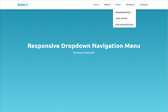
Here's a responsive dropdown navigation menu for Webflow. An easy cloneable that can be added to your Webflow site to get your navigation up and running quickly. Best of all it's already responsive and mobile ready.
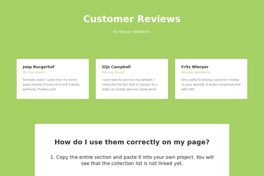
An excellent way of adding a customer review/social proof CMS component to your Webflow site. These reviews work perfectly with Webflow's native CMS and is also responsive and mobile friendly.