
The Top 70 Card Webflow cloneables
Webflow cards don't need to be boring. Webflow cloneable card designs with glowing 3D effects to basic card designs.


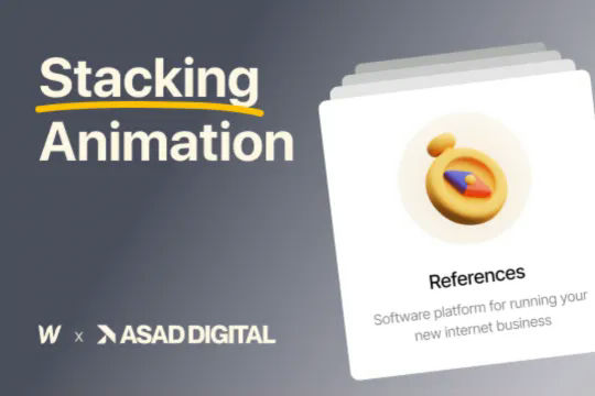
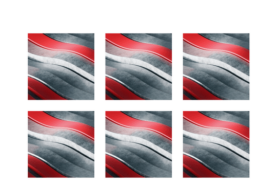
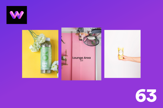
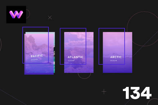
A unique stacking cards on scroll interaction in Webflow. When you scroll down the page the cards on the right side stack on top of each other. A unique interaction perfect for a SaaS or technology site. The stacking cards effect was built entirely using Webflow interactions and does not require any additional code or scripts. The effect is created by using the While scrolling into view trigger, with the use of Scale and Filter. The filter applied reduces the overall brightness of the card and the scaling is used to send the item back smaller. Overall a well designed and thought out solution for a stacking card interaction.


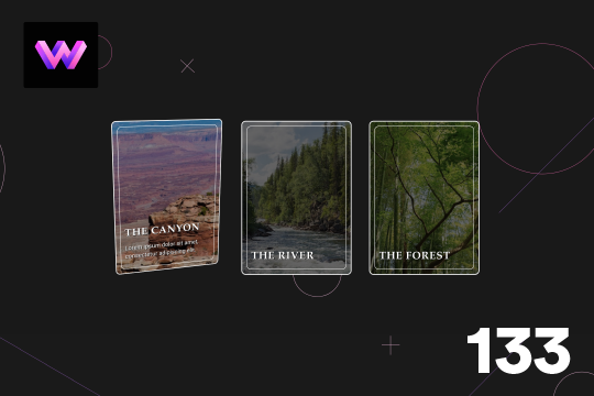
A beautiful Swiper.js overlapping cards slider built for Webflow. This Swiper.js slider is perfect for a hero section or features section of a site. When a user navigates between slides the top card is removed and the next card in line comes into view. The cards are stacked with various offsets so it looks like playing cards. There are text transitions for each text associated with the slide. This slider was created using Swiper.js and utilizes Webflow's native CMS collections. This allows you to dynamically generate slides based on the collection list items. This requires custom code so be sure to look at the pages custom code for the Swiper.js code. You can modify the Swiper.js code to include grabcursor, looping, and utilizing arrows to navigate between slides.
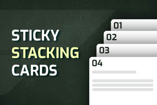

A way of utilizing sticky cards that stack on scroll in Webflow. Using position sticky and a scrolling into view interaction allows for this effect without any custom code.

A unique 3D looping card animation built with zero code on Webflow. This is perfect for a unique way to display features, services, images and more on a site. This infinite looping card animation continues endlessly and provides a fun and unique interaction animation that adds a dynamic flair to your Webflow site.
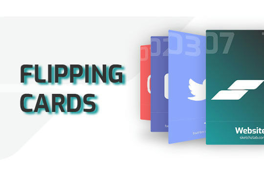
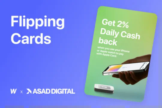
Here's a way of adding a flipping card animation to cards on your site. This component can be used for a number of scenarios and allows for additional information to be displayed on your cards without taking up important site real estate.
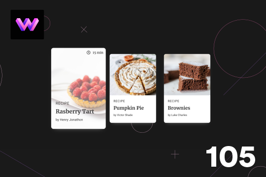

Here's a unique, recipe card animation created in Webflow. This is perfect for showcasing recipes on your Webflow site in a unique and interactive way. When hovering over the card the image becomes full height, and the card moves forward on the z-axis. The card was placed in a wrapper with a perspective applied to it to bring the card forward. Also a timer icon shows up on the top right corner to display the time it takes to create each recipe.
Showcase and feature your CTA by adding moving lines to the border in Webflow. Using this technique you can showcase anything that you want to draw the users eyes to by adding moving lines and a 3D hover rotation to products, cards and other important aspects on your site.
A unique product card animation on hover in Webflow. When a user hovers over a card the image shifts down, and a border appears with an animation, there's also a description of the card that appears as well. This animation effect was built entirely with Webflow's native interactions.
A unique 3D glassmorphism interaction and animation that utilizes a combination of video, Webflow interactions and Custom CSS. When a user hovers over a card the card rotates and 3D transforms based on Webflow interactions. The technique for the glassmorphism is powered by custom CSS using backdrop-filter blur and image masking. In order for this to work properly you will need to add the custom CSS code with this cloneable. Pay attention to the Webflow interaction that is powering the cards 3D transform techniques. An excellent example of using Webflow interactions, CSS and a little bit of creativity to create glassmorphism 3D cards in Webflow.
A 3D flipping cards interaction perfect for adding additional information to Webflow cards utilizing Webflow interactions. When a user clicks on the + sign of a card the card flips over to showcase additional information about the product. This cloneable features no additional custom code and was created using Webflow interactions. Using mouse click the card flips 180 degrees via the Y axis. This is accomplished using Z index and 3D transforms using the backface functionality. A simple, yet sophisticated flipping card interaction that's perfect for any Webflow site.


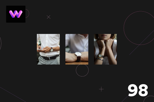
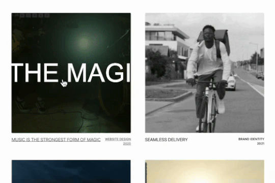
A unique expanding portfolio hover interaction built completely with Webflow interactions. When a user hovers over these portfolio items they expand to showcase a larger version of the image. This cloneable was built using entirely Webflow's native interactions and does not require any additional code or HTML embeds. The Webflow interaction uses the Element trigger on mouse hover targeting the class so that all classes will have the same Webflow interaction. When the user hovers over the size of the item expands, on hover out the item returns to the original state. A clean, lightweight solution to create expanding portfolio items in Webflow.

Well designed card hover transitions/interactions for Webflow. When a user hovers over a card the card changes colors, moves the content up, removes the icon and adds a link indicator. Perfect for dynamic cards/feature sections within Webflow. This was created with minimal hover interactions.


Fourteen different testimonial components perfect for your Webflow site. These modern and well designed testimonials were created to help you add a testimonial section to your site quickly. The first variation has testimonials featured in an off centered design, the second variation showcases a simple 3 design with a primary quote and user avatar. The third variation is a large slider perfect to include a larger testimonial section to your site. Other variations included branded colored cards in a slider, a picture of the person with their company logo over their face, a large centered slider, a twitter card style, a video testimonial, tab testimonials and many other variations. This is a perfect cloneable if you wanted to add simple or complex designed testimonials to your site.
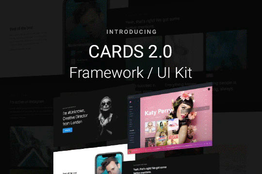

Cards 2 is an amazing UI kit and framework to allow you to quickly design and wireframe your next landing page using Webflow. There are over 100+ different prebuilt symbols and components included for hi-fidelity wireframing for any UI/UX designers. Create landing pages and designs faster with the Cards 2.0 UI kit directly in Webflow and ready to be published directly with code. This UI kit includes 50 new cards as Webflow components/symbols in both dark and light variations. 3 complete landing page designs in both dark and light. Symbols/components for both hero sections, features, testimonials, team, pricing pages, blog posts and more. These are responsive for all 4 breakpoints and all cards are offered in a Sketch file. This UI kit allows you to build your designs faster and begin the design process directly in Webflow.
Here's a fun card interaction in which the cursor acts like a peeling of a label on a Webflow card. Perfect interactions to add a new layer of dynamic flair to your otherwise boring Webflow cards.

A sticky, stackable cards section that stacks upon scrolling on the Webflow site.
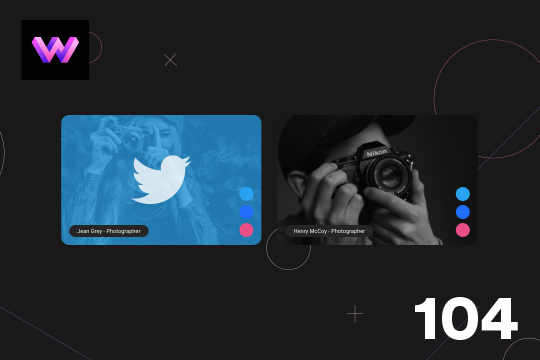
Here's a unique way to show off your team cards on your Webflow site. When you hover over a card a social media panel appears on the right hand side. The dots are color coded to match the brand color of the social media platform. You can place text or icons inside of these dots as well. On the hover a panel appears with the brand color and a large social media icon. The image rotates -10 degrees to 10 degrees on hover. The animation is pretty straight forward. The only thing to note is that the dots had to placed in the same wrapper so that when you hover over the dots you could target a sibling element within the interaction. This allowed to make sure that the effect could be repeated across multiple cards by targeting the sibling classes of the dots.
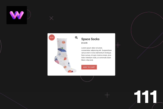
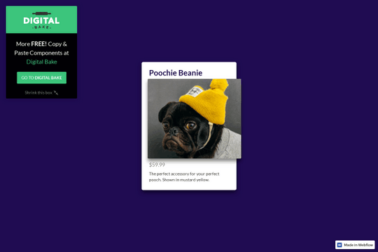
A product card with hover animations for Webflow. When a user hovers over the card the title of the product appears, and a few icons appear as well as the price staggered from the bottom. There is a cart icon that can be used to add the product to the cart, an eye icon which can link to the product page, and a heart icon that can link to a counter of some type.
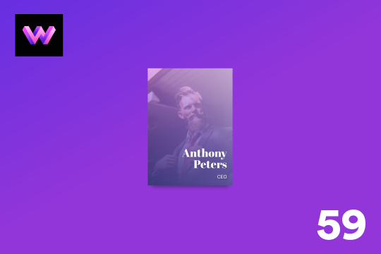
A unique card hover animation in Webflow that creates a 3D parallax style interaction. A great example of what can be built using Webflow's native interactions. When hovering over the card a two layer parallax effect is shown with the top transparent purple layer separating from the bottom image layer. Both layers seem to transform in a 3D space while the Name and Title moves at a different rate than the other two cards.
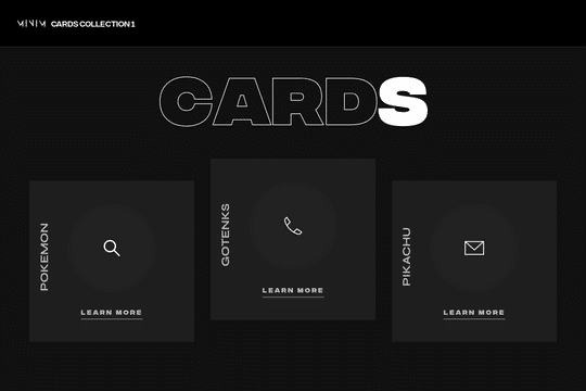
An example of an expanding image cards on hover menu and navbar in Webflow. This full page menu adds a hover interaction that expands cards or images on hover in your Webflow menu.

A set of unique 3D cards in Webflow with hover over animations and unique interactions. These dark themed cards include mouse cursor interactions in which the cards create a 3D effect on hover. At the same time the cards have a hover animation in which a circle grows and changes the card from dark, to white with all icons/text and everything changing on the hover state.
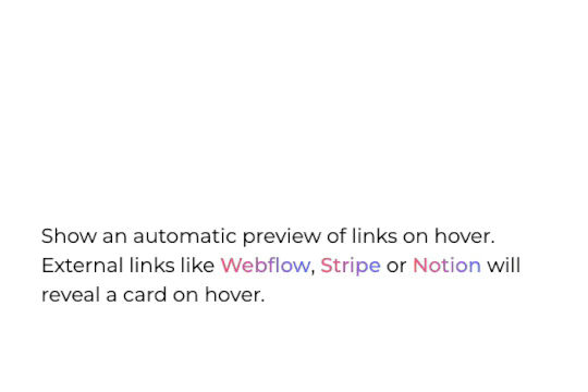

Allow visitors to preview a site thumbanil on external link hover in Webflow. This feature allows you to get a preview of the site that you're linking to without having the user leave your site. It works by extracting the external links on page load, it then grabs a screenshot of those sites and reveals it on link hover. The card's position is calculated using custom code and thus works with inline links and link blocks. Just change the external link and preview will be updated automatically. Replace the demo screenshot API with your own in your live builds.


An example of how to create a sticky navigation sidebar in Webflow. Perfect for blogs, article pages or other sites that require a sticky sidebar in Webflow. In this demonstration there are three examples of sticky sidebars to showcase that multiple can be added to the same site.
Here's a 3D parallax style card interaction/animation for Webflow. With this effect a card rotates on mouse move, and the image inside the card rotates 360 degrees that gives the effect that hte card is moving. A caption also appears on the bottom section when hovering on the card. The card is in a 3D wrapper with a child perspective applied to give it a 3D effect as it moves.
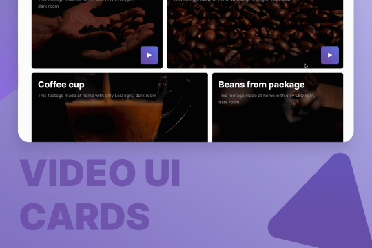

Here are quite a few, well designed UI layouts for video cards and elements for video sections. You'll find hero sections, grids for video blogs, play button animations, and pop-up modals for videos for your Webflow site.
Here's a product card with image zoom on hover for Webflow. When the user hovers over the product image it scales up and zooms so the user can see more information about the physical product. This was accomplished by placing the image div inside of a wrapper with an overflow hidden. When the user hovers over the image wrapper the image div scales up to double the size. Then with the mouse over element interaction the image moves in different directions when hovering over the image wrapper. This allows the user to hover around the image to see different parts.
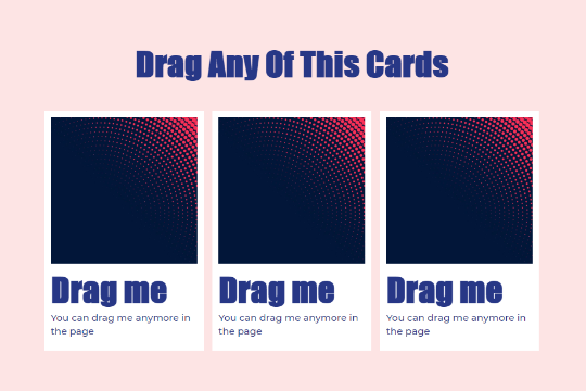

Make your Webflow site content dynamic and fully interactive with these draggable content cards. A fun way of creating a dynamic layout that users can move, modify and play with on your Webflow site.
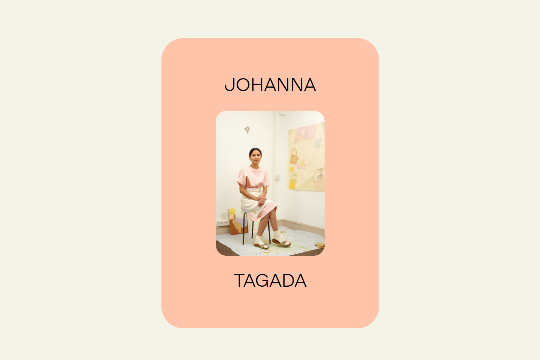
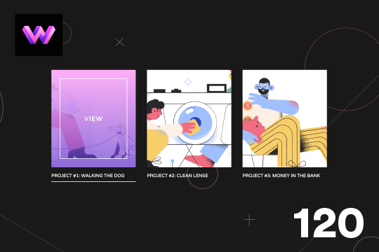
A product card that displays the title on hover and follows the mouse in Webflow. This interaction is a very well designed interaction that flips the image and provides the title on mouse hover. The title then follows the mouse cursor over each card, displaying the relevant product names title.
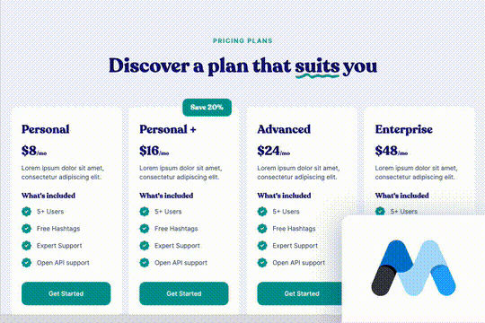

A fun and unique green pricing table design for Webflow. This pricing table design features a large headline and a four section pricing table with a unique hover over interaction. When a user hovers over a card the card is attracted to the mouse and moves around a bit. The pricing cards feature product information as well as a primary discounted card label for a package. A great design to get your Webflow sites pricing section built out quickly.
Here is a 3D info card animation on hover in Webflow. When you hover over the card an image panel rotates in horizontally to reveal the content. The effect was achieved by adding a div block with a child perspective applied to it. Then another div blcok was added inside of the 3D wrapper. With the interactions this div block was rotated from 90 degrees to 0 degrees on the X axis. Since the wrapper has a child perspective it creates a 3D effect for the panel as it comes in. It also has a reveal from top to bottom as the panel comes in.

Here's a nice hover over interaction for a product card for your Webflow site. Upon hover over of the card the text fades behind the card and the image/product is grown on top of the text.

Three amazingly designed call to action section scroll interactions created in Webflow. These call to actions are perfect for the bottom of your Webflow sites to create eye popping dynamic elements that draw the users attention.
A demonstration of product cards in Webflow that utilize hover over interactions to effect both image and title. When a user hovers over the cards in Webflow the image div grows and the title appears to follow the mouse while hovering over each card. A fun interaction and a way to showcase products in a unique and creative way.
Here's a unique hover effect for the portfolio cards in Webflow. When hovered, the card image expands and fades into a video. There's an infinite marquee that is then overlaid to provide a unique effect.

A card interaction that displays additional information upon click in Webflow. This interaction was built entirely with Webflow's native interactions and requires no additional code. When a user clicks on the card the image reduces size and zooms out while the text information of the card appears.

A great 3D card interaction for products or listings of services on your Webflow site. Upon hovering on the card the purchase link pops out and the card fully 3D transforms to follow the mouse movement. A great way of taking a static product card div and turning it fully dynamic.
A dynamic info card hover interaction for Webflow. When a user hovers over the card a box moves from the title and displays a description while the image changes to color. A wonderful interaction that adds a level of animation and interaction to an info card.

Here are well designed service cards that have a rotation hover interaction that highlights and rotates the card for Webflow. This perfect for adding 3D dimension to a Webflow site via service cards, project cards or even pricing tables.
A great category card hover animation/interaction for Webflow. Adding this effect to your Webflow site creates a custom card animation/interaction effect. When you hover over the card the circle scales up to fill the entire card with a color and then the border color becomes white. The text also becomes white to be more readable on the background color. This effect is achieved by placing an inner circle, circle border, and an icon within a circle wrapper. With interactions the circle scales up, and the border and background circle change color on hover. Each card has a unique and separate mouse out interaction so that it can revert back to the individual cards color.
A simple landing page perfect for a digital business card via a QR code or other short URL. This design feature a hover slider effect and large cards to make it easy for users to navigate your digital business card site.

Easily add an Instagram feed to your Webflow site with these premade Instagram feed designs. Twelve different Instagram feed design components allow you to easily add your latest Instagram posts to your Webflow site. Keep in mind that these are simply the design components and do not include the code to work properly. You'll either need to use a 3rd party tool or manually add your instagram posts yourself. These Instagram feed designs feature a variety of different styles from masonry grids to stacked and Instagram style cards.
Here's a wonderful 3D card hover effect in Webflow. When a user hovers over a card a 3D effect is shown and folds down and additional information is displayed. This is achieved via interactions and rotates the image 90 degrees back and a content wrapper rotates 90 degrees on hover. The effect was achieved by placing an image wrapper and a content wrapper inside of the 3D wrapper. The 3D wrapper has a child perspective applied to it via the transform option. This allows the div block inside of the wrapper to have a 3D effect as they rotate in and out. The transform-origin for the image wrapper was set to the bottom and the transform-origin for hte content wrapper was set to top. In the interactions rotation and opacity animations to both the image wrapper and content wrapper. Both div blocks are rotated on the x-axis.
Here's a wonderful parallax card animation on mouse moving/hover states in Webflow. This effect uses a gradient overlay that moves with the mouse on hover, and the border moves in the opposite direction of the mouse while hovering. The text moves and rotates left and right with the mouse movements. This effect was achieved by placing the gradient overlay and border within the card wrapper. The text was placed in the bottom right of the border div using flexbox. Then, interactions were added via the mouse move over element and the elements move and rotate on the x and y axis when the user moves over the card wrapper.
Here's a project card animation on hover in Webflow. When hovering over the image a gradient overlay and text appears on the card. Lines also animate around the image and blow the project title and below the image. The effect is achieved by placing the lines in teh correct position around the image and then setting the initial scale to 0 in interactions. The lines horizontal x-axis is set to 0, and the vertical line is also set to 0. The transform-origin for each line around the image is set so that each line animates into the correct position. Then the lines scale back to 1, and the gradient overlay and text changes from 0% to 100%.

An advanced jQuery card hover interaction for Webflow. When users hover over the cards they expand and grow and feature a unique mouse hover over interaction in which the icons shift while hovering in a specific card. The background colors change and the buttons transform into a different call to action button. This is a fully responsive interaction and requires a bit of custom code to implement. To get this to work copy the section-end-cta and copy the code found in the closing body tag on the homepage.
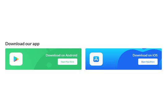

A simple and clean app download call to action in Webflow with animations and interactions.
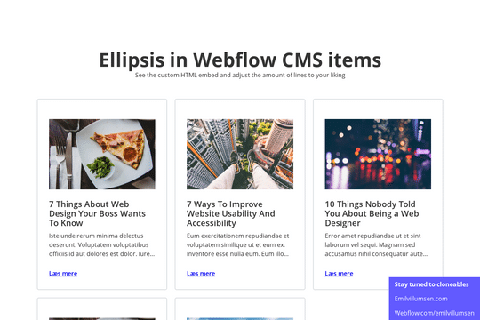

Here's a way of creating a text/content limit for how many lines of text that you'd like a paragraph of text to display. This allows you to have artificial limits to limit clients or keep design elements similar. Refer to the HTML embed code to achieve this and adjust the code according to your needs.
An info card for Webflow that features hover over interactions. This free Webflow cloneable features cards with unique hover over interactions. When a use hovers over the card the image turns from black and white to a color gradient overlay and an information block is shown with additional information about the post/card.
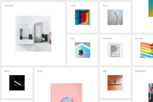
A massive grid that moves objects into view as the mouse moves into the viewport. This is perfect for large product pages, portfolio items and much more in which you want to add a dynamic and interactive grid to your Webflow site. This demonstration uses a combination of Symbols/components and Webflow's mouse move in viewport interactions to generate a large grid that can be navigated by the users mouse. As the user hovers over the image or item card the image expands. All powered without any custom code and using Webflow's interactions and symbols/components.